Entry tags:
recent scribal efforts
After a bit of a dry spell where I was too busy to think of anything but work, I've recently picked up my pens and brushes. I'm really happy with how this backlog AoA turned out:


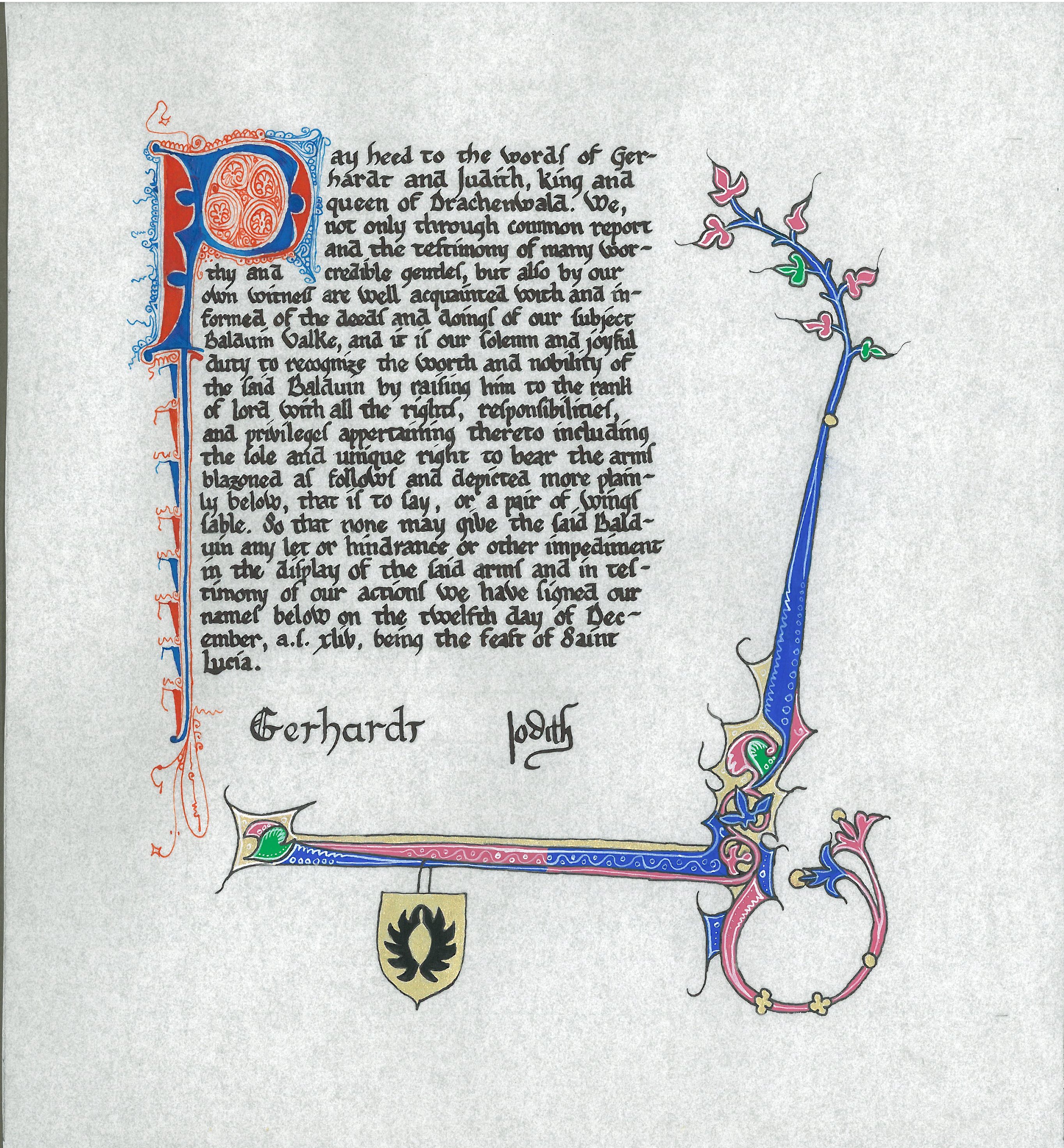
It is based on British Library MS Burney 275 f.336, French, between 1309 and 1316. This design caught my eye because it combines both penwork and painting. I only wish that I had had space to try including the grotesques.
It took me about four days; the penwork P was done the first day, the border was drawn, inked, and painted the second day, the white work and the painting of the arms on the third day, and finally, the calligraphy on the last day.
Here is the text:
It's always way more fun to do an AoA scroll for someone who has registered arms than for someone who doesn't.
I've also completed two scrolls for Crown, but I'll wait until after the event before posting them, even though I've got versions with the names blocked out right now.
It is based on British Library MS Burney 275 f.336, French, between 1309 and 1316. This design caught my eye because it combines both penwork and painting. I only wish that I had had space to try including the grotesques.
It took me about four days; the penwork P was done the first day, the border was drawn, inked, and painted the second day, the white work and the painting of the arms on the third day, and finally, the calligraphy on the last day.
Here is the text:
Pay heed to the words of Gerhardt and Judith, King and Queen of Drachenwald. We, not only through common report and the testimony of many worthy and credible gentles, but also by our own witness are well acquainted with and informed of the deeds and doings of our subject Balduin Valke, and it is our solemn and joyful duty to recognize the worth and nobility of the said Balduin by raising him to the rank of lord with all the rights, responsibilities, and privileges appertaining thereto including the sole and unique right to bear the arms blazoned as follows and depicted more plainly below, that is to say: Or, a pair of wings sable. So that none may give the said Balduin any let or hindrance or other impediment in the displaying of the said arms and in testimony of our action we have set our hands below on the 12th day of December, a.s. xliv, being the feast of Saint Lucia.
It's always way more fun to do an AoA scroll for someone who has registered arms than for someone who doesn't.
I've also completed two scrolls for Crown, but I'll wait until after the event before posting them, even though I've got versions with the names blocked out right now.
no subject
no subject
If you want to take the next step closer to period look, apply the lighter shade first, then go in with the "full" colour, sometimes there is a third darker shade as well, but not always. And lastly the highlight. It's quite simple, nearly as fast, and instantly gives the painting a tiny bit of three-dimensionality, making it pop a little more off the page. I just mix the "full" colour with a bit of white and off I go with the lighter shade.
That was the thought that struck me as I looked at your fabulous product :)
no subject