This was my project for Sunday:
Lindquistringes for Katherine Percival


A back-log Lindquistringes, based on British Library MS Arundel 134 f. 2, France, 2nd half of the 13th C. I'm much happier with how this penwork initial turned out (the ratio of white space to colored space in the inner bit is much closer to the original), though I still feel like I don't know how to finish off the ends -- my flourishes at the end of the vertical block aren't right.
And, man, Gothic hands are my downfall. This is a very sorry attempt. I just can't seem to keep all my angles the same and all my vertical lines straight. sigh.
Lindquistringes for Katherine Percival
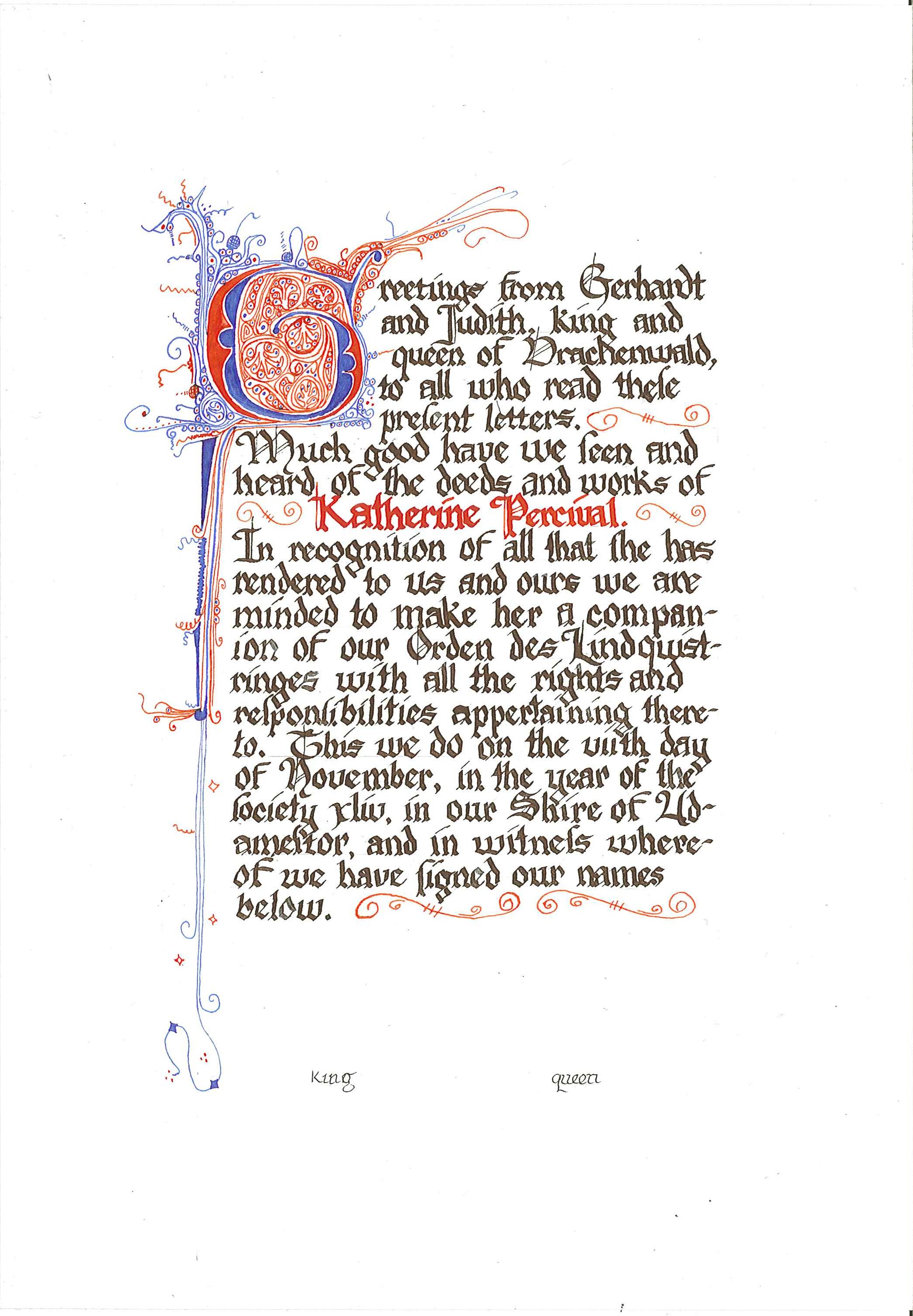
A back-log Lindquistringes, based on British Library MS Arundel 134 f. 2, France, 2nd half of the 13th C. I'm much happier with how this penwork initial turned out (the ratio of white space to colored space in the inner bit is much closer to the original), though I still feel like I don't know how to finish off the ends -- my flourishes at the end of the vertical block aren't right.
And, man, Gothic hands are my downfall. This is a very sorry attempt. I just can't seem to keep all my angles the same and all my vertical lines straight. sigh.
no subject
Date: 2010-01-27 02:10 pm (UTC)If we can borrow a pen and some ink in April, let me watch your as you do gothic--I might be able to help because it might be a body thing.
(no subject)
From:(no subject)
From:(no subject)
From:(no subject)
From:(no subject)
From:no subject
Date: 2010-01-27 02:20 pm (UTC)If so, one thing I learned ages ago was to put a sheet of graph paper between the lightboard and the scroll. This not only gives you horizontal guide lines but also vertical ones. Helps with the up and down.
(It's because of the up and down that I try to avoid gothic.)
(no subject)
From:no subject
Date: 2010-01-27 05:18 pm (UTC)Satisfy my curiosity: what the heck is a "Lindquistringes" (besides a Drachenwald award) and how do you pronounce it?
(no subject)
From:no subject
Date: 2010-01-27 07:07 pm (UTC)I'd be happy to do some textura quadrata coaching with you if you like. A lot of blackletter/minim work has a lot to do with pen and hand position and fiddly geometries of spacing. (as, I'm sure, you realise)
no subject
Date: 2010-01-27 07:21 pm (UTC)(no subject)
From:no subject
Date: 2010-01-27 11:23 pm (UTC)That being said, I think you are being too hard on yourself. Your work is lovely and everyone's hand is a bit different. Just keep practicing and you will notice an improvment over time... but I really think this is lovely.
(no subject)
From: